Visualizing a Graph in Microsoft Sentinel
07 Jan 2025
In this Tutorial we will have a look at creating a simple Graph and visualize it in Azure Sentinel.
I started exploring this for an Advent of Code
Start by creating a new Workbook in Azure Sentinel, and add a new query. The next step is to add some data
example data
The Graph needs a single table filled with Nodes and Links, we accomplish this with a union of these both tables. Be aware that the Column names might clash, so take care naming them
let Nodes = datatable(Id: long, NodeName: string) [
    1, 'A',
    2, 'B1',
    3, 'B2',
    4, 'C1',
    5, 'C2',
    6, 'C3',
];
let Links = datatable(Source: long, Destination: long) [
    1, 2,
    1, 3,
    3, 4,
    3, 5,
    3, 6,
];
Nodes
| union (Links)
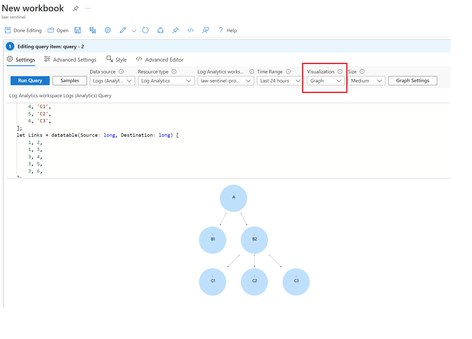
Add this query to the workbook, select Graph as visualization and enter the following values in the Graph Settings:
Layout settings
- Node ID: Id
- Source Id: Source
- Target Id: Destination
- Initial Flow: Flow Vertical
To display the node name, add the Node Name to the Node Format Settings (e.g. Select Left Content), to show the Node Name on the left side.
The final result looks like this:
related resources
https://techcommunity.microsoft.com/t5/microsoft-sentinel-blog/graph-visualization-of-external-teams-collaborations-in-azure/ba-p/1356847 https://docs.microsoft.com/en-us/azure/azure-monitor/visualize/workbooks-graph-visualizations